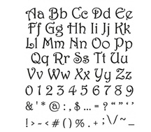
One of the challenges faced by many students is deciding which kind of font to use when they are making a PowerPoint presentation. They are aware of the fact that attractiveness is a key factor in making a slide. But not only does the slide need to be attractive, but it also needs to be discernible and informative. Many students look through other PowerPoint presentations that are on the Internet and examine how they have been made. They look at the colors that have been used for the slide and closely examine the fonts that the content has been written with.
If students were to look through a font guide then they will find that fonts are ideally split into three categories. The first category is called Serif. These are the kinds of fonts that have an extra tail at the end of the letters. Times New Roman and Palatino Linotype are the well known types in the Serif category. Many students prefer to use the Times New Roman font for their presentation as it is what they are most comfortable with, although these fonts can be hard on the reader’s eyes unless they are used in combination with a large font size.
The Sans Serif font does not have the extra tail at the end of letters, and many readers consider this category of fonts the easiest to read. Students can use these fonts for both the main title and the body. If the readers do not spend much time understanding the slides, they can focus more on what the speaker has to say when the presentation is being made.
The final category of fonts is called scripts. The problem with scripts is that they try to emulate human handwriting and can appear illegible to those watching a PowerPoint presentation. There are a large variety of fonts on offer, and students can take their time and pick one which would impress the readers the most.
Post your Queries in the comments or Reach us at [email protected]

 RSS Feed
